Color Schemes in Material Design 3 for Jetpack Compose
Material Design 3 represents the most recent iteration of Google’s Material Design, which serves as a comprehensive user interface design system employed in Android and various other Google products. Material Design 3 introduces fresh color schemes, typography, and shapes to enhance the visual appeal and overall dynamic nature of the design.
In this article, we will discuss color schemes for a Material Design 3 Jetpack Compose project.
In Jetpack Compose, there are three files located within the theme folder. These are “Color.kt”, “Theme.kt”, and “Type.kt”, respectively. In the Color file, you can set your colors. In the Theme file, you can set the main theme of the application. In the Type file, you can set your text styles and fonts.
@Composable
fun TestTheme(
    darkTheme: Boolean = isSystemInDarkTheme(),
    // Dynamic color is available on Android 12+
    dynamicColor: Boolean = false,
    content: @Composable () -> Unit
) {
    val colorScheme = when {
        dynamicColor && Build.VERSION.SDK_INT >= Build.VERSION_CODES.S -> {
            val context = LocalContext.current
            if (darkTheme) dynamicDarkColorScheme(context) else dynamicLightColorScheme(context)
        }

        darkTheme -> DarkColorScheme
        else -> LightColorScheme
    }
    val view = LocalView.current
    if (!view.isInEditMode) {
        SideEffect {
            val window = (view.context as Activity).window
            window.statusBarColor = colorScheme.primary.toArgb()
            WindowCompat.getInsetsController(window, view).isAppearanceLightStatusBars = darkTheme
        }
    }

    MaterialTheme(
        colorScheme = colorScheme,
        typography = Typography,
        content = content
    )
}
In Jetpack Compose, you can no longer directly modify the style (theme configuration) that you define for an activity and in the AndroidManifest file. Jetpack Compose includes the above theme file codes by default. Here, it generates colors with artificial intelligence based on the colors you define with dynamic color. For example, unless you change it, your navigation bar’s color will change by creating a new color based on the primary color you defined. Here, if you wish, you can disable dynamicColor by setting it to false. Additionally, if you want your theme to be only a dark or light theme, you can easily edit it from this file. In color schemes, there are many color types:
• primary: The main color of your application.
• onPrimary: The color of text and other elements placed on the primary color.
• primaryContainer: A color that contrasts with the primary color.
• onPrimaryContainer: The color of text and other elements placed on the primaryContainer color.
• inversePrimary: The inverse of the primary color.secondary: The secondary color of your application.
• onSecondary: The color of text and other elements placed on the secondary color.
• secondaryContainer: A color that contrasts with the secondary color.
• onSecondaryContainer: The color of text and other elements placed on the secondaryContainer color.
• tertiary: The tertiary color of your application.
• onTertiary: The color of text and other elements placed on the tertiary color.
• tertiaryContainer: A color that contrasts with the tertiary color.
• onTertiaryContainer: The color of text and other elements placed on the tertiaryContainer color.
• background: The background color of your application.
• onBackground: The color of text and other elements placed on the background color.
• surface: The surface color of your application.
• onSurface: The color of text and other elements placed on the surface color.
• surfaceVariant: A variant of the surface color.
• onSurfaceVariant: The color of text and other elements placed on the surfaceVariant color.
• surfaceTint: A tint that can be applied to the surface color.
• inverseSurface: The inverse of the surface color.
• inverseOnSurface: The color of text and other elements placed on the inverseSurface color.
• error: The color used for error messages.
• onError: The color of text and other elements placed on the error color.
• errorContainer: A color that contrasts with the error color.
• onErrorContainer: The color of text and other elements placed on the errorContainer color.
• outline: The color used for outlines.
• outlineVariant: A variant of the outline color.
• scrim: A color used to darken background elements.
val primaryLight = Color(0xFF007ACC)
val onPrimaryLight = Color(0xFFFFFFFF)
val secondaryLight = Color(0xFF4CAF50)
val onSecondaryLight = Color(0xFFFFFFFF)
val tertiaryLight = Color(0xFFFFC107)
val onTertiaryLight = Color(0xFF000000)
val backgroundLight = Color(0xFFF5F5F5)
val onBackgroundLight = Color(0xFF000000)
val surfaceLight = Color(0xFFFFFFFF)
val onSurfaceLight = Color(0xFF000000)
val errorLight = Color(0xFFFF0000)
val onErrorLight = Color(0xFFFFFFFF)
val errorContainerLight = Color(0xFF6200EA)
val onErrorContainerLight = Color(0xFFFFFFFF)
val outlineLight = Color(0xFF9E9E9E)
val outlineVariantLight = Color(0xFFBDBDBD)
val scrimLight = Color(0xFF000000)

val primaryDark = Color(0xFF2962FF)
val onPrimaryDark = Color(0xFFFFFFFF)
val secondaryDark = Color(0xFF8BC34A)
val onSecondaryDark = Color(0xFFFFFFFF)
val tertiaryDark = Color(0xFFE91E63)
val onTertiaryDark = Color(0xFF000000)
val backgroundDark = Color(0xFF121212)
val onBackgroundDark = Color(0xFFFFFFFF)
val surfaceDark = Color(0xFF262626)
val onSurfaceDark = Color(0xFFFFFFFF)
val errorDark = Color(0xFFFF0000)
val onErrorDark = Color(0xFFFFFFFF)
val errorContainerDark = Color(0xFF8A4B08)
val onErrorContainerDark = Color(0xFFFFFFFF)
val outlineDark = Color(0xFF757575)
val outlineVariantDark = Color(0xFF616161)
val scrimDark = Color(0xFF000000)
Furthermore, let’s integrate these colors into the color schemes.
private val DarkColorScheme = darkColorScheme(
    primary = primaryDark,
    onPrimary = onPrimaryDark,
    secondary = secondaryDark,
    onSecondary = onSecondaryDark,
    tertiary = tertiaryDark,
    onTertiary = onTertiaryDark,
    background = backgroundDark,
    onBackground = onBackgroundDark,
    surface = surfaceDark,
    onSurface = onSurfaceDark,
    error = errorDark,
    onError = onErrorDark,
    errorContainer = errorContainerDark,
    onErrorContainer = onErrorContainerDark,
    outline = outlineDark,
    outlineVariant = outlineVariantDark,
    scrim = scrimDark
)

private val LightColorScheme = lightColorScheme(
    primary = primaryLight,
    onPrimary = onPrimaryLight,
    secondary = secondaryLight,
    onSecondary = onSecondaryLight,
    tertiary = tertiaryLight,
    onTertiary = onTertiaryLight,
    background = backgroundLight,
    onBackground = onBackgroundLight,
    surface = surfaceLight,
    onSurface = onSurfaceLight,
    error = errorLight,
    onError = onErrorLight,
    errorContainer = errorContainerLight,
    onErrorContainer = onErrorContainerLight,
    outline = outlineLight,
    outlineVariant = outlineVariantLight,
    scrim = scrimLight
)
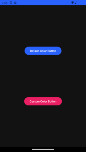
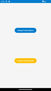
Suppose you have defined a blue color for the dark theme and a red color for the light theme as the primary color. In that case, all buttons will be blue for the dark theme and red for the light theme. However, let’s say you want to use the color you defined for tertiary as the button color. In this situation, you can change the color as follows.
@OptIn(ExperimentalMaterial3Api::class)
@Composable
@NonRestartableComposable
fun CustomButtons() {
    Scaffold { paddingValues ->
        Column(
            modifier = Modifier
                .fillMaxSize()
                .padding(paddingValues),
            verticalArrangement = Arrangement.SpaceEvenly,
            horizontalAlignment = Alignment.CenterHorizontally
        ) {
            Button(
                onClick = { /*TODO*/ },
            ) {
                Text("Default Color Button")
            }
            Button(
                onClick = { /*TODO*/ },
                colors = ButtonDefaults.buttonColors(
                    containerColor = MaterialTheme.colorScheme.tertiary
                )
            ) {
                Text("Custom Color Button")
            }
        }
    }
}
If you had done this by directly assigning a color, there would have been a conflict between the light and dark themes. In other words, you can easily use the color you defined as tertiary for both themes on the button.


