
Modifying the Ripple Color for Clickable Elements in Jetpack Compose
Modifying ripple color in Jetpack Compose is a straightforward process. However, ripple effects can occasionally become bothersome, particularly on items in the bottom navigation bar. In this article, I will demonstrate how to alter the color of these effects and modify their animations.
Define your CustomRippleTheme class as illustrated below.
class CustomRippleTheme(private val color: Color): RippleTheme {
    @Composable
    @ReadOnlyComposable
    override fun defaultColor() = color

    @Composable
    @ReadOnlyComposable
    override fun rippleAlpha() = RippleAlpha(
        draggedAlpha = 0.0f,
        focusedAlpha = 0.0f,
        hoveredAlpha = 0.0f,
        pressedAlpha = 0.0f,
    )
}
With this class, we extend our existing class using RippleTheme and override its methods. The defaultColor method allows us to change the color of the ripple. Simultaneously, the rippleAlpha method can be used to modify the animation of the ripple.
Let’s proceed to apply this to our clickable elements. To accomplish this, we will utilize CompositionLocalProvider. When you supply your custom ripple theme using this method, it will be applied to all your clickable elements.
@Composable
@NonRestartableComposable
fun CustomTextButton(
    modifier: Modifier = Modifier,
    onClick: () -> Unit,
    clickedColor: Color,
    placeHolder: String
    ) {
    CompositionLocalProvider(
        LocalRippleTheme provides CustomRippleTheme(clickedColor)
    ) {
        TextButton(
            modifier = modifier,
            onClick = { onClick() }
        ) {
            Text(
                text = placeHolder,
                style = MaterialTheme.typography.titleLarge
            )
        }
    }
}
There is no need to create an additional composable function for this purpose. You can provide your CustomRippleTheme in any composable. It will be applied when you place your clickable element within the CompositionLocalProvider block
@Composable
fun Buttons(modifier: Modifier = Modifier) {
Column(
modifier = modifier
.fillMaxSize(),
verticalArrangement = Arrangement.Center,
horizontalAlignment = Alignment.CenterHorizontally
) {
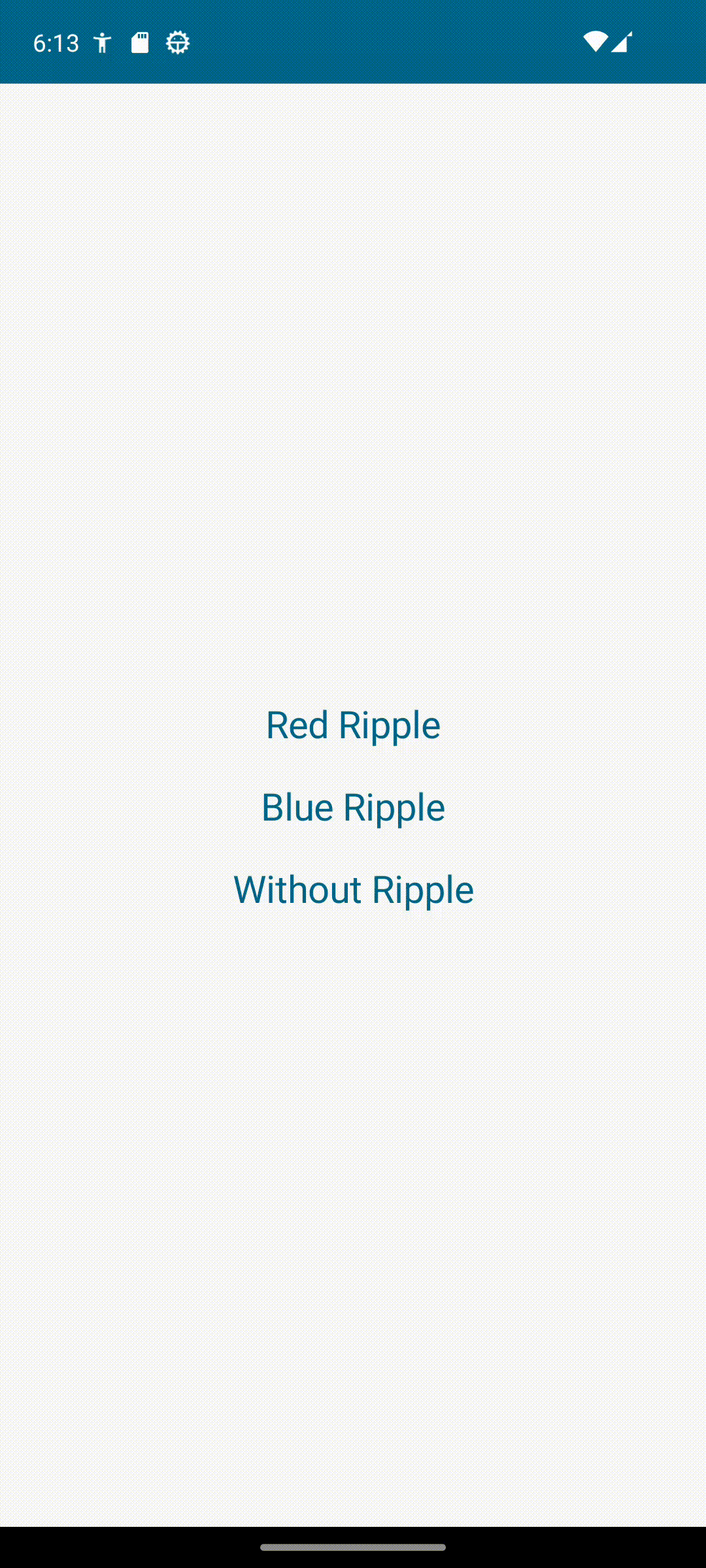
CustomTextButton(
onClick = { },
clickedColor = Color.Red,
placeHolder = "Red Ripple"
)
CustomTextButton(
onClick = { },
clickedColor = Color.Blue,
placeHolder = "Blue Ripple"
)
CustomTextButton(
onClick = { },
clickedColor = MaterialTheme.colorScheme.background,
placeHolder = "Without Ripple"
)
}
}
@Composable
@NonRestartableComposable
fun CustomTextButton(
modifier: Modifier = Modifier,
onClick: () -> Unit,
clickedColor: Color,
placeHolder: String
) {
CompositionLocalProvider(
LocalRippleTheme provides CustomRippleTheme(clickedColor)
) {
TextButton(
modifier = modifier,
onClick = { onClick() }
) {
Text(
text = placeHolder,
style = MaterialTheme.typography.titleLarge
)
}
}
}
class CustomRippleTheme(private val color: Color): RippleTheme {
@Composable
@ReadOnlyComposable
override fun defaultColor() = color
@Composable
@ReadOnlyComposable
override fun rippleAlpha() = RippleAlpha(
draggedAlpha = 0.0f,
focusedAlpha = 0.0f,
hoveredAlpha = 0.0f,
pressedAlpha = 0.0f,
)
}


